OnePlus Open Review: Raising the Bar
Samsung is the current and undisputed leader in foldables when it comes to sales in India. Whether it’s the features that Samsung’s foldables offer or the brand’s identity as a premium smartphone brand, there’s no ignoring the fact that Samsung has been consistent when it came to launching every single foldable offering, it brought to the world in India. Indeed, this also speaks volumes about Samsung’s commitment to the finer details that matter when it comes to foldables, like software support and after-sales service.
OnePlus has been chasing Samsung in the premium segment for the past few years. What started out as a brand that was out to make a change (when it came to software and hardware) with affordable “flagship killers” has now matured into a swan of sorts with proper premium devices that rival big brands like Samsung, Motorola and more. Apart from offering great value, OnePlus’ products also focus on a well-optimised software experience. Over the years, the Chinese smartphone brand has even managed to develop its own ecosystem of devices, be it audio accessories, tablets, TVs and more, which kind of brings it on par with Samsung, if not Apple.
So, what happens when a brand as competitive as OnePlus decides to take on the one area that’s been Samsung’s speciality for the past four years? Can it outdo Samsung’s experience with foldables? Will fans or customers be interested in risking their money in the smartphone segment, which has been dominated by Apple and Samsung? Read on to find out!
OnePlus Open price in India
The OnePlus Open is priced at Rs. 1,39,999 in India and has 16GB of RAM and 512GB of storage. The device is available in two finishes – Emerald Dusk and Voyager Black. I received the Voyager Black unit for review. In the box, OnePlus provides an 80W charger, a two-piece polymer protective case and a USB Type-A to Type-C cable for charging and data transfers.
OnePlus Open Review: Design
OnePlus smartphones are usually known for their premium and rounded designs. It’s only OnePlus’ affordable Nord series of devices, which have off-late been given chiselled designs with flat sides and sharp edges to appeal to its younger customers. The Open is a big departure from the regular design language we have come to expect from premium OnePlus smartphones.
![]()
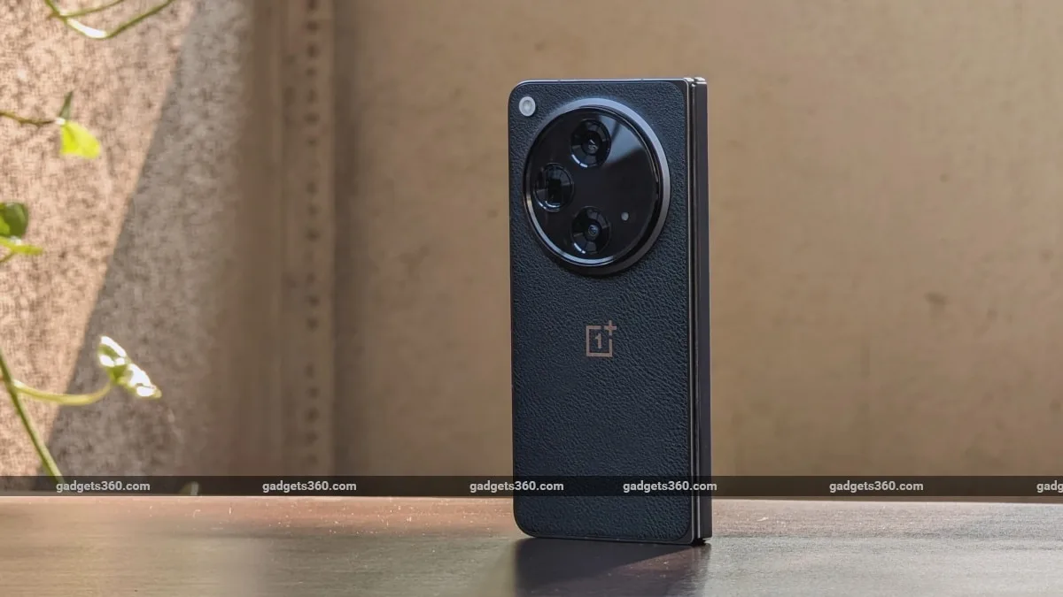
The OnePlus Open’s Voyager Black finish gets a faux leather back
I absolutely love the camera-like appearance of the Voyager Black finish, which will instantly remind anyone of a retro camera. There’s a nice faux leather texture around the back of the phone, which, apart from giving it a distinct and unique appearance, also adds loads of grip. The soft-finish metal frame in grey also reminds me of high-end professional cameras, while the large, raised camera module at the back completes the look. The placement of the flash unit outside the camera module is also very unique. All in all, the OnePlus Open feels very special and premium, which is quite unlike Samsung’s Galaxy Z Fold 5, which mostly appears like a regular smartphone.
Like with most foldables, when folded, the hinge sits on the left side of the phone when closed. While Samsung’s Galaxy Z Fold 5 does a fine job of concealing it because of its largely rounded design, the hinge on the OnePlus Open (although polished to perfection) does poke into my hand, which does feel a bit uncomfortable. This happens when the phone is in my left hand as I did not end up making contact with the hinge when held in my right hand.
Another detail that requires a bit of learning is the placement of the buttons. When folded, the top half of the device has the iconic Alert slider switch, while the bottom half has the power button and the volume controls. OnePlus smartphones typically have the Alert slider and power button on the right side, while the volume rocker is found on the left.
![]()
The OnePlus Open has an odd button layout which is very different from a typical OnePlus smartphone
After using this smartphone for several weeks, I still struggle to find the volume button, which is placed a bit too high up on the right side. And once you “open” the Open, your Alert slider changes position to the left side of the phone. OnePlus should have gone with its typical layout for all three buttons instead of something different, even though I understand that Open is not a typical OnePlus smartphone.
Another topic that frequently comes to mind when choosing a foldable is weight. Samsung Galaxy Z Fold’s aren’t shy about this, as they have often weighed over a quarter of a kilo (253g, to be precise). Google’s Pixel Fold is heftier at 283g, which means you will notice the bulk in your pocket even if they have slimmer designs (which they don’t). OnePlus has done a fine job in this regard. It weighs between 239 – 245g (depending on which finish you choose), is a lot slimmer when unfolded and weighs as much as last year’s iPhone 14 Pro Max (240g), all of which is almost unbelievable given what we have been used to from Samsung’s heavier foldables over the past couple of years.
![]()
The OnePlus Open has a unique hinge which makes the phone very slim and compact
However, a point to keep in mind when comparing these foldables is that OnePlus has skipped the wireless charging feature, which both Samsung and Google’s foldables offer. And this is probably one of the reasons for the Open’s slimmer and lighter-than-usual design.
Lastly, for a phone that costs as much as the Open and given how slim they have managed to make it, I’m glad that OnePlus has included the bare minimum when it comes to IP ratings. The OnePlus Open has an IPX4 rating which is good for splashes of rain and offers basic water resistance. Samsung offers better in this regard with an IPX8 rating.
OnePlus Open Review: Specifications and software
It’s nice to see OnePlus go all out when it comes to hardware with its Open foldable. There’s a Qualcomm Snapdragon 8 Gen 2 SoC, which is paired with 16GB of RAM and 512GB of storage. There’s no expandable storage slot in the SIM card tray, but you do get space for two SIM cards, which a lot of power users will find appealing.
There’s a 7.82-inch main 2,268 x 2,440 pixels, AMOLED display with a 1.0758:1 (almost 1:1) aspect ratio and 120Hz screen refresh rate with LTPO 3.0 support. It is protected by an ultra-thin glass (UTG) solution. The cover display measures 6.31-inches, has a resolution of 1,116 x 2,484 pixels and a 20:09 aspect ratio, is also of the AMOLED variety and also has a 120Hz refresh rate with LTPO 3.0. What is also impressive about these displays is that OnePlus offers a 240Hz touch sampling rate, which is useful when playing demanding games.
The fingerprint reader is embedded into the power button, and it worked reliably during the review period. Connectivity options include Wi-Fi 7, Bluetooth 5.3, NFC and support for various global positioning systems. Last but not least is a USB Type-C port with USB 3.1 support and an infrared port at the top for controlling other devices or appliances.
![]()
Thanks to Open Canvas, the Open can run three apps in a triple-split layout plus a fourth app in a floating window
Being OnePlus’ first foldable, I was quite excited to try out OxygenOS 13, which has been optimised for this foldable. OnePlus has yet to officially roll out OxygenOS 14, which is based on Android 14, this is a bit disappointing given that Samsung has already begun its Android 14 rollout for its Galaxy Z Fold 5 and other recently launched devices.
Surprisingly, the customisations are very similar to what I experienced with its recently launched premium tablet, the OnePlus Pad (Review). The app layouts are similar as well, but OnePlus offers a new Open Canvas software feature which lets me open up to three apps side by side in a split-screen-like format.
While Samsung also lets me do the same, Samsung’s One UI usually lets the first app take up one-half of the main display while the other two apps share a quarter of the remaining half. Open Canvas lets one open two apps side by side in a dual-split layout with both apps taking up one-half of the main display and then makes space for a third app which can run at the side with a tiny portion of it visible when in this triple-split layout. I just have to tap on that strip, and the entire screen shifts to one side to reveal the second and third apps completely.
I can even do a four-finger pinch to view all three apps (four if you are using an additional windowed app) at the same time and perform a four-finger spread-out gesture to exit Full View mode. Indeed, Open Canvas sure makes for a hassle-free way to run three apps at a time, making good use of the main folding display, despite its odd 1:1 display aspect ratio.
![]()
The Recent Folder lets you drag and drop files into supported apps
Another handy software addition is the Recent Folder in the taskbar, which sits at the bottom. Tapping on it brings up recent photos, screenshots, files and other items which can simply be dragged and dropped into apps which support this functionality. The triple-split app layouts combined with the Recent folder make for a very desktop-like layout and make good utilisation of the main display.
OnePlus Open Review: Performance
The impressive part about the OnePlus Open’s multitasking capabilities is that it all works buttery smooth. I experienced no lag and no hiccups or stuttering while operating the device.
![]()
Some apps like Google’s Keep will need the device to be rotated horizontally to get into tablet mode
One detail that I was not too happy about is mainly to do with how Android works. A majority of apps which support a tablet-like layout (like Google’s Keep) will often display an app in that mode, only when rotated in landscape mode. With Google Pixel Fold, the foldable opens into its landscape model directly thanks to its passport-like wider cover display and main display. With the Open, it gets harder to tell which orientation one is in, you will have to re-orient the device to figure that out and get apps to run in the tablet or foldable mode, which offers a split-screen or multi-instance interface. Thankfully most messaging apps support a split screen layout even when held vertically, with chat threads visible on one side and a chat open on the other.
![]()
Movies shot in widescreen for theatres have a lot of letterboxing on the Open’s squarish main display
When viewing Netflix shows (which are typically shot in 16:9 widescreen), there is an advantage to opening up the main display as the content does appear bigger than on the cover display. However, this can’t be said about apps like YouTube or other OTT apps, which host content or movies that have been produced in wider formats (for theatres) with varying aspect ratios. These appear quite odd with plenty of letterboxing and indeed appear better on the cover display or a regular 19.3:9-19:5:9 aspect ratio display, which are available on most regular flagship smartphones. I was glad to see a Samsung Flex-mode-like support on some video apps, which lets one half of the main display stand up while the other half supports the phone, letting me watch the video at ease without the need for a kick-stand cover or case.
As for the cover display, it is broad enough (20:9) and almost functions like a regular smartphone compared to the Samsung Galaxy Z Fold 5’s low-resolution cover display, which appears more like a TV remote (23.1:9). However, it still isn’t as broad as a regular smartphone (19.5:9), so the typing experience may feel a bit cramped for some. However, I did find the Open’s cover display sufficiently large and comfortable while playing games.
![]()
The cover display on the OnePlus Open is sufficiently wide and can be used as a regular phone
While the phone performed as expected in our regular benchmarking tests with scores on par with other devices which had the same processor, gaming performance was quite impressive. The 240Hz touch sampling rate is leagues better in terms of response than what Samsung has to offer on its Galaxy Z Fold 5. The phone also comes with various optimisations and a slide-out gaming console which has a Pro Gamer mode (for unthrottled display and processor performance) and even a Championship mode, which cuts out any distractions. Indeed, the OnePlus Open is the first foldable I have come across which actually caters to mobile gamers and it all worked well, no matter which game I ran on it.
![]()
The light display crease created by the hinge is barely noticeable
Both displays also support, HDR10+ and Dolby Vision formats, which makes it more than ideal for Netflix and other OTT apps that offer supported content. The odd three-speaker setup is quite impressive in terms of audio quality, it manages to provide a good spatial sound accompanied by decent bass, which is impressive coming from a device with an overall thickness of a USB-C port. Another detail about its display is that it does actually come with stylus support (Oppo Pen), it’s just that OnePlus has not released its official accessory.
Foldables have always given us a bit of battery anxiety, but Samsung’s Galaxy Z Fold 5 did take things up a notch, delivering more than a day’s battery life on a single charge. The OnePlus Open raises the bar when it comes to battery life and charging.
With casual usage, I could easily manage over a day and a half on a single charge. With heavy usage, which also included half an hour of gaming, an hour of video streaming, and 15 minutes of video recording and photos, I often ended up with around 40 percent battery life before I hit the sack. This, on most days, was not enough to convince me to charge the phone overnight as I was confident that the phone would easily last me till noon the next day. Indeed, the OnePlus Open is the first foldable I have used that literally behaves like a regular phablet-sized flagship when it comes to battery life.
![]()
The OnePlus Open only offers wired charging
As mentioned earlier in this review, the phone does lack wireless charging like on the Galaxy Z Fold 5. But it makes up for it with 80W wired charging which is leagues faster than what its competitor is capable of. The charger managed to charge the device to 67 percent in 30 minutes and complete the charge in just 53 minutes, which is a lot faster than the Galaxy Z Fold 5.
OnePlus Open Review: Cameras
The OnePlus Open packs an impressive set of cameras for a foldable device. There’s a 48-megapixel primary camera (with OIS), a 64-megapixel telephoto camera with 3X optical zoom (with OIS) and a 48-megapixel ultra-wide-angle camera with a 114-degree field of view. As with every horizontal foldable, there are two selfie cameras, a 32-megapixel camera embedded into the cover display and a 20-megapixel camera embedded into the main folding display. The sensor behind the primary camera is a special one as it is a part of Sony’s new LYTIA series, which is the long-awaited upgrade to its ExmorRS sensors. It has larger photodiodes which basically collect twice as much light. Its stacked architecture also means that it’s compact enough to fit into this foldable’s skinny frame while being able to deliver the performance of larger sensors.
![]()
The OnePlus Open has a very capable rear camera layout
Video recordings max out at 4K 60fps, but the phone also offers Dolby Vision video recording, which is limited to 4K 30fps. The camera interface is typically OnePlus, which means it comes with customisable shooting modes, and thanks to the brand’s collaboration with camera maker Hasselblad, photos get a very unique colour treatment. Also present is the XPan mode for snapping photos in a wider-than-usual 35mm panoramic format. And because you can shoot with the main display open, one can also preview photos in a split screen-like view (instead of tiny thumbnails) while shooting.
OnePlus Open daylight camera samples. Top to bottom: Primary camera, telephoto camera, macro mode (tap images to expand)
Image quality across the board is quite impressive, especially after some recent software updates which brought big improvements to the portrait mode and the telephoto camera. The primary camera snaps quality photos with good contrast and plenty of resolved detail in all types of lighting conditions. These images show slightly saturated colours and have a slightly contrasted appearance thanks to Hasselblad’s colour inputs. While I usually prefer more natural-looking colours, I really appreciated Hasselblad’s input with this camera system.
OnePlus Open daylight zoom camera samples. (tap image to expand)
The telephoto camera is definitely the highlight of this new camera system. It shoots photos at 3X optical zoom and can even shoot 6X in-sensor zoom, which is said to offer lossless quality. Images shot at the native 3X zoom appear quite sharp and pack in plenty of detail in all types of lighting conditions. It struggles a bit with fast-moving subjects like a pet or kids, but when they do manage to stay remotely still, the results look brilliant with a natural bokeh. Photos captured using the 6X in-sensor zoom also appeared quite good, with image quality holding up to 10X and deteriorating beyond that.
OnePlus Open low light camera samples. Top: Primary camera (night mode) bottom: Ultra-wide-angle camera (night mode)
Ultra-wide angle photos come out with good detail and dynamic range, but I noticed plenty of purple fringing in the brighter areas of the image. In low light, I found the images captured from this camera to be a bit soft.
Since you can use the rear cameras for snapping selfies (using the cover display as the viewfinder), I managed to take tack-sharp selfies in all kinds of lighting conditions. Results from the cover display and main display selfie cameras were decent.
OnePlus Open low-light selfie camera sample (using primary camera)
Videos come out sharp with no noise in daylight, but low-light video sees some noise even when captured under good indoor lighting. Dolby Vision recording, when enabled, sees a noticeable drop in video quality and is far from what’s possible on an Apple iPhone 15 Pro Max. Low light video captured in 4K at 30fps or 60fps is still usable, just that I have seen regular premium smartphones perform a lot better at this price point when recording in the same scenarios. The telephoto camera also does a good job of shooting video with noise-free and well-stabilised output in daylight.
OnePlus Open Review: Verdict
With the Open, OnePlus has really changed my perspective about foldables. Horizontal foldables no longer have average cameras, decent battery life, charge slowly, and weigh over a quarter of a kilo. There’s finally a foldable that lets you leave behind these shortcomings we have gotten used to or consider to be the norm over the past few years.
OnePlus has raised the bar indeed. The Open has little to no compromises made when compared to regular premium flagship smartphones. And that itself speaks volumes about how much OnePlus has distanced itself from Samsung. The OnePlus Open offers a high-resolution cover display which can be used like a regular smartphone, a large foldable display with well-optimised software, the same level of performance that’s expected from an ultra-premium flagship and for once quality cameras on a foldable.
Apart from offering better displays, better cameras (on paper), faster charging and better battery life, it’s also priced lower than Samsung’s Galaxy Z Fold 5 (Review). What’s not to like?


