Oppo Find N3 Flip Review: Building on Basics
When competing with Samsung for vertical foldables, Oppo has always gone with more. More screen space, more cover display, more camera. While doing all of this, the Chinese smartphone brand has also gone with a more refined hinge, all of which worked in favour of the Oppo Find N2 Flip when I compared it with the Galaxy Z Flip 4 early this year—a few months on, Motorola released its Razr 40 Ultra, which offered a radical design with an edge-to-edge cover display (and embedded cameras) along with features like an IP rating and wireless charging. A few months later, Samsung launched a refreshed Galaxy Z Flip 5, which followed the trend set by Motorola and offered a large, squarish cover display but fell short on execution with badly optimised software.
And now we have Oppo’s second attempt at a vertical foldable. Surprisingly, Oppo has not given in to the trend set by Motorola by going with a square cover display. Oppo retains its tall rectangular cover display but has come up with new tricks to make it more useful. It’s also got a brand-new camera system and an alert slider, which seems to be borrowed from OnePlus. The rest remains pretty much the same, but is it enough to take on Samsung’s Galaxy Z Flip 5 and the Motorola Razr 40 Ultra? Let’s find out.
Oppo Find N3 Flip Review: Price in India
The Oppo Find N3 Flip is priced at Rs. 94,999 and offers 12GB of RAM and 512GB of storage. There are just two finishes to choose from – Cream Gold and Sleek Black. Oppo’s pricing seems quite competitive compared to Samsung’s Galaxy Z Flip 5, which is still priced at Rs. 99,999 for its base 8GB RAM and 256GB storage option and goes up to Rs. 1,09,999 for the 512GB storage variant. In contrast, Motorola’s Razr 40 Ultra is priced even lower at Rs. 79,999, for which you get 8GB of RAM and 256GB of storage.
![]()
The Oppo Find N3 Flip’s front and rear panels are made from Corning Gorilla Victus glass
Samsung’s clamshell may seem a bit too expensive, but you have to keep in mind that between the three flagship foldables, it’s the only one to offer the updated Qualcomm Snapdragon 8 Gen 2 SoC. It also offers an IPX8 rating for water resistance and Qi wireless charging.
Oppo Find N3 Flip Review: Design
Oppo’s design for the Find N3 Flip remains very similar to the Find N2 Flip it replaces. It has a very likeable, rounded design, which feels comfortable to hold compared to the sharper edges and flat sides of the Galaxy Z Flip 5. However, I miss the matte finish available on the Astral Black version of the Find N2 Flip, as this glossy finish is very slippery.
While the overall finish of this foldable definitely looks and feels luxurious, I did notice some sharp edges at the bottom edge of both halves (when folded), where the curved outer panels meet the flat frame. For a phone that’s priced near Rs. 1 lakh, I expected better attention to detail. Thankfully, Oppo includes a basic yet matte-finished case in the box, which snaps perfectly onto both halves and adds some grip.
![]()
Like the Oppo Find N2 Flip, the Find N3 Flip also folds shut without any visible gap
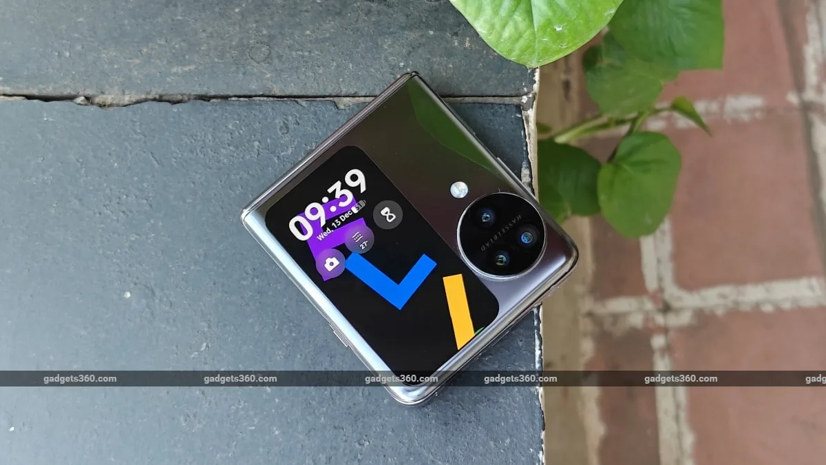
The rectangular cover display on the top half remains the same as before. And I believe Oppo has left it in this orientation to accommodate the triple rear camera setup, which is a first for clamshell foldable globally. I like the design of the triple rear camera layout, which appears very unique and is about the same size and thickness as a Rs. 10 coin.
Even though it is as thick as a coin, the circular camera module with the Hasselblad branding does not add much to the overall thickness of the device, both when opened or folded. It is broad enough not to make the phone wobble when placed open on a flat surface.
On the left side of the device (whether opened or closed) is the iconic OnePlus alert slider. This is indeed the first Oppo device to get this feature, I found the three-stage slider convenient for changing device profiles. While it may feel unusual for Oppo users, who typically have a clean and buttonless left side, OnePlus users looking to switch to a vertical foldable will find it handy and familiar.
![]()
The inner folding display has thin bezels, and its width is broad enough for a comfortable typing experience
As for the inner folding display, the crease is very shallow and barely visible, and so are the bezels, which are very thin on all four sides. These bezels are also quite flat, making swipe-in or swipe-out gestures at the edges of the display a very good experience. The inner folding display, just like the previous model, does not gather fingerprints easily. Even if you manage to get the display smudged up, wiping them off requires little effort.
Going back to that tall cover display, there is something very off about the way Oppo advertises it. Given the left-sided layout of the cover display (when held folded with the hinge up), I often had to reach for it over the circular camera module to operate it, which, given my fairly large hands, seemed fine but still not right.
To my surprise, I soon discovered that Oppo wants its users to use the phone with the hinge down (and not at the top), making that left-handed display perfectly reachable for right-handed folks. However, it brings up the odd layout problem for its fingerprint reader, which moves to the other side and will then need to be unlocked by your ring finger instead of your thumb, which I found nonsensical.
So, I tried unlocking the phone in this “advertised orientation” with my right hand and the display on the right, and the phone worked as expected. However, flipping it open upside down means you will have to use both hands or risk swinging the phone around (bringing the hinge up) with one hand and then flip open the phone like one normally would.
![]()
Right-handed users will need to stretch a bit (over the camera bump) to use the left-aligned cover display
In short, the best way to use the cover display is with the hinge on top and the display on the left, the way one would normally flip open the main display. Those with small hands will have trouble using it this way, given the width of this phone.
The barely visible display crease and thin and flat bezels are all possible because of this clamshell foldable’s hinge, which Oppo has branded as the Flexion hinge. Made of aircraft-grade steel, it has a water drop design, which lets both halves of the foldable close with no visible gap in between. Oppo claims that its hinge can last up to 10,00,000 folds, which I could not test nor verify.
However, I can explain how the hinge feels. And it’s quite good. Just like the Oppo Find N2 Flip’s hinge, I found this hinge to be very responsive and light to operate. It’s not as loose as the Motorola Razr 40 Ultra’s hinge and not as tight as the Samsung Galaxy Z Flip 5’s hinge. I could open and shut it without much effort with the same hand, meaning that Oppo has hit the sweet spot when it comes to the tension and force needed to operate this foldable.
![]()
The Oppo Find N3 Flip’s hinge feels smooth and is light enough to operate with one hand
Unlike Samsung’s hinge, Oppo’s has a sweet spot (within 45-120 degrees) between which one-half of it can remain upright. Pushing it beyond this sweet spot will see the phone slam shut or unfold fully.
Another design feature that the hinge also allows for is an IP rating. Oppo’s Find N3 Flip finally gets an official IPX4 rating for water resistance, but this is quite basic, and it mainly works against splashes of water or light rain. This means you may need to head to the service centre if your foldable falls into a tub or a pool.
Oppo Find N3 Flip Review: Specifications and Software
The Oppo Find N3 Flip, just like its predecessor, uses a MediaTek processor. This time, it’s been upgraded from the MediaTek Dimensity 9000+ SoC to a Dimensity 9200 SoC (4nm). Oppo offers 12GB of LPDDR5X RAM and 256GB of UFS 4.0 storage. There’s support for the several 5G bands along with dual-5G standby and space for two nano SIM cards (or 1 SIM card and one eSIM). Communication standards include Wi-Fi AC, Bluetooth 5.3, NFC, a USB Type-C port and support for the usual global positioning systems. The phone’s fingerprint reader is built into the power button and worked reliably during the review period. There’s a 4,300mAh battery with 44W wired charging but no wireless charging.
The phone runs Oppo’s ColourOS 13.2, based on Android 13. It offers everything we have come to expect from the skinned operating system, which also powers OnePlus smartphones. All the settings for the cover display are tucked into a separate section in the Settings app called ‘Foldable features’. Here, one can change the cover screen wallpaper and add or remove mini-apps and third-party apps.
The cover display in terms of functionality is a big leap over the previous model, which only ran mini versions of native apps (that functioned more like widgets). Oppo still retains parts of the old interface with the so-called “Mini apps” (mini versions of native apps like weather, timer, etc.), which are limited in number and also introduce a selection of full apps (which includes several third-party apps), just like on the Galaxy Z Flip 5.
![]()
Both supported and non-supported apps will see the above prompt when responding to and opening notifications
Apps can transition from the cover display to the main display but not back, which I did find a bit strange. But given that the cover display will be used mainly for quickly responding to messages via voice, it’s not as capable as the Samsung Galaxy Z Flip 5’s display in terms of functionality. One can also respond via a full keyboard in supported third-party apps, but it’s a bit too squished to be used, given the width of this cover display.
And just like the latter, third-party app support for the cover screen is still in beta. If you want to open a notification from them, you will still have to tap to expand the notification from the lock screen (or the notifications tray). Once expanded, there are two choices: “Open app” (in the cover display itself) or “Unfold to continue”(via the main screen). Upon selecting the first option, you are taken directly to that section of the app or thread in the cover display, provided Oppo has added it to its beta bouquet of supported apps.
![]()
The Oppo Find N3 Flip can run select third-party apps on its cover display
These third-party apps can also be launched via the cover screen launcher (swipe left from the main clock face). This list of apps has grown during the period of the review itself, but not all apps are supported. Thankfully, you can reply to most messaging apps (even unsupported ones) via the cover display’s built-in reply system, which offers emojis, customisable preset text replies, and custom replies using voice-to-text. In short, it’s still not as seamless as the Motorola Razr 40 Ultra’s cover display, which is by far the best implementation I have used on a clamshell foldable. And this also means you will end up opening and accessing the main display often.
Oppo Find N3 Flip Review: Performance
The Oppo Find N3 Flip’s software performance is pretty good. I faced no lag or stuttering when using the phone in the default battery mode, which seemed more than enough for all the apps I use daily. The phone performed as expected in our benchmark tests as well. The phone managed lower scores than Samsung’s Galaxy Z Flip 5, which is powered by a custom Qualcomm Snapdragon 8 Gen 2 SoC, managing an AnTuTu score of 10,27,655 and Geekbench scores of 1,116 and 3,325 points in its single and multi-core tests, respectively. It offers a dual speaker setup with a speaker at the top doubling up as the receiver but sounds as loud as the primary one at the bottom. They provided balanced sound and good clarity even at high volumes.
The gaming performance was quite impressive. Call of Duty: Mobile worked well at all settings, including the recently available Medium graphics and Ultra frame rate combination, which lets the phone reach a good 120fps when playing games. The phone heated up while playing games, but it did not seem to get too hot, and performance did not suffer either.
![]()
The inner folding display is bright enough to tackle direct sunlight and supports HDR10 content
The touch sampling rate when playing the game was also quite good, registering swipes accurately when using the Pro Gamer mode in the slide-out gaming console. This is an area where Samsung has struggled for a while, so it is good to see such a smartphone offering a good gaming experience in such a compact package.
While I enjoyed gaming on this phone, its display still feels as delicate as the previous model. So, I did notice a few dents on the main Schott UTG display (as a result of gaming) over the course of the review. Indeed, Oppo’s display still does not seem as tough as Samsung’s solution for its foldables.
The Oppo Find N3 Flip managed good battery life, easily lasting me a whole day and a bit more. On the busiest of days, even with half an hour of gaming and camera usage, it still managed to have at least 20 per cent left in the tank. Oppo seems to have done a great job of optimising the software and hardware, and this is more so because I rarely ended up using the cover display during my review because of its rather limited functionality.
![]()
The cover screen offers a battery-friendly way to consume video content, provided the app is supported
This is a solid upgrade over the Oppo Find N2 Flip, which was also enough to last a whole day but was not on par with Samsung’s Galaxy Z Flip 4 when it came to battery life. The phone managed a solid score of 23 hours and 54 minutes in our HD video loop test, which is a lot better than what the Galaxy Z Flip 5 (16 hours and 45 minutes) and Motorola’s Razr 40 Ultra (18 hours and 27 minutes) managed in their respective tests.
And when the battery does die out, the phone charges up to 58 percent in 30 minutes and completes the charge in 1 hour and 5 minutes, which is also quite fast compared to the competition.
Oppo Find N3 Flip Review: Cameras
The Oppo Find N3 Flip is the first smartphone to offer a properly premium camera setup on a clamshell foldable. With that, we have a 50-megapixel primary camera (OIS), a 32-megapixel telephoto camera with 2X optical zoom and a 48-megapixel ultra-wide camera with a 114-degree field of view and a minimum focus distance of 4cm (when using macro mode). A 32-megapixel front-facing camera handles selfies. Just like OnePlus’s partnership with camera maker Hasselblad, which resulted in vibrant photos, Oppo’s rear camera is also a result of the same partnership and tends to show similar results.
![]()
The Oppo Find N3 Flip offers a very impressive array of high-resolution cameras for a compact smartphone
The primary camera captures photos with good, resolved detail and clarity in all types of lighting conditions. They come out a bit saturated but have a good dynamic range. Since I could use the cover display as a viewfinder, I could also snap portraits of myself with the camera, which came out sharp and with good edge detection. This worked wonders in low light as selfies appear crisp and with excellent detail in comparison to the actual selfie camera, which is embedded into the folding display. Even close-ups of objects came out sharp and had a natural bokeh.
Oppo Find N3 Flip Primary camera samples. Top to bottom: daylight, low-light, portrait mode selfie (tap images to expand)
The telephoto camera, a first for a clamshell foldable, did a fine job providing good close-up shorts with a nice natural bokeh in daylight. It loses some detail when shooting in low light conditions, but the photos are still quite usable. The images captured at 5X magnification using the in-sensor lossless zoom are also usable in daylight (with some noticeable purple fringing) but not so much in low light.
The 2X telephoto camera shoots sharp images with excellent detail in daylight (tap image to expand)
The colour tones produced by the ultra-wide-angle camera look a bit cooler compared to photos captured by the primary camera. These pack in good detail and surprisingly have good sharpness, but you cannot pixel peep. Dynamic range is quite good as well, bringing out enough detail in the shadows, but there’s noticeable barrel distortion towards the edges of the image. Macro photos came out surprisingly well, letting me get quite close to objects, the details are also quite sharp, but the colours were a bit cooler.
Oppo Find N3 Flip camera samples. Top: Primary camera, bottom: Ultra-wide-angle camera in macro mode (tap images to expand)
The phone is capable of recording 4K video at 30fps on all cameras thanks to their high-resolution sensors. However, I found the recorded videos to be a bit underwhelming in terms of detail and clarity. Stabilisation was decent, but the camera isn’t able to maintain a steady framerate while shooting. The low-light video also looked decent with good stabilisation but did have noticeable noise.
Oppo Find N3 Flip Review: Verdict
It’s quite obvious with the two foldable releases from team Oppo and OnePlus (BBK Electronics) that the two brands have put up enough of a challenge, raising the bar for Samsung’s upcoming foldables, which are expected to be called the Galaxy Z Flip 6 and the Galaxy Z Fold 6.
I have no doubt that the OnePlus Open is a clear winner compared to what Samsung currently offers in 2023. But I have mixed feelings about the Oppo Find N3 Flip. I’m also not a big fan of its vertical cover display layout and am quite confused about whether Oppo will get rid of this layout for something better with the next model.
While the Find N3 Flip’s raw performance (including gaming), overall camera quality and battery life (including charging) are quite impressive for a clamshell foldable, it’s all stuck behind an oddly laid out cover display experience, one that will vary depending on the apps that you use on a daily basis. Pick this one if you don’t use the cover display often on your current foldable or don’t intend to on your first one.


